Summary
During my 2,5 years at Pixelboxx I worked in a number of projects that challenged me as a UX/UI Designer. I'd like to highlight some of the projects in which I was involved.
- Modernized the applications visual language.
- Created a design system foe supporting the development workflow.
- Created additional icons, illustrations and logos.
Introduction
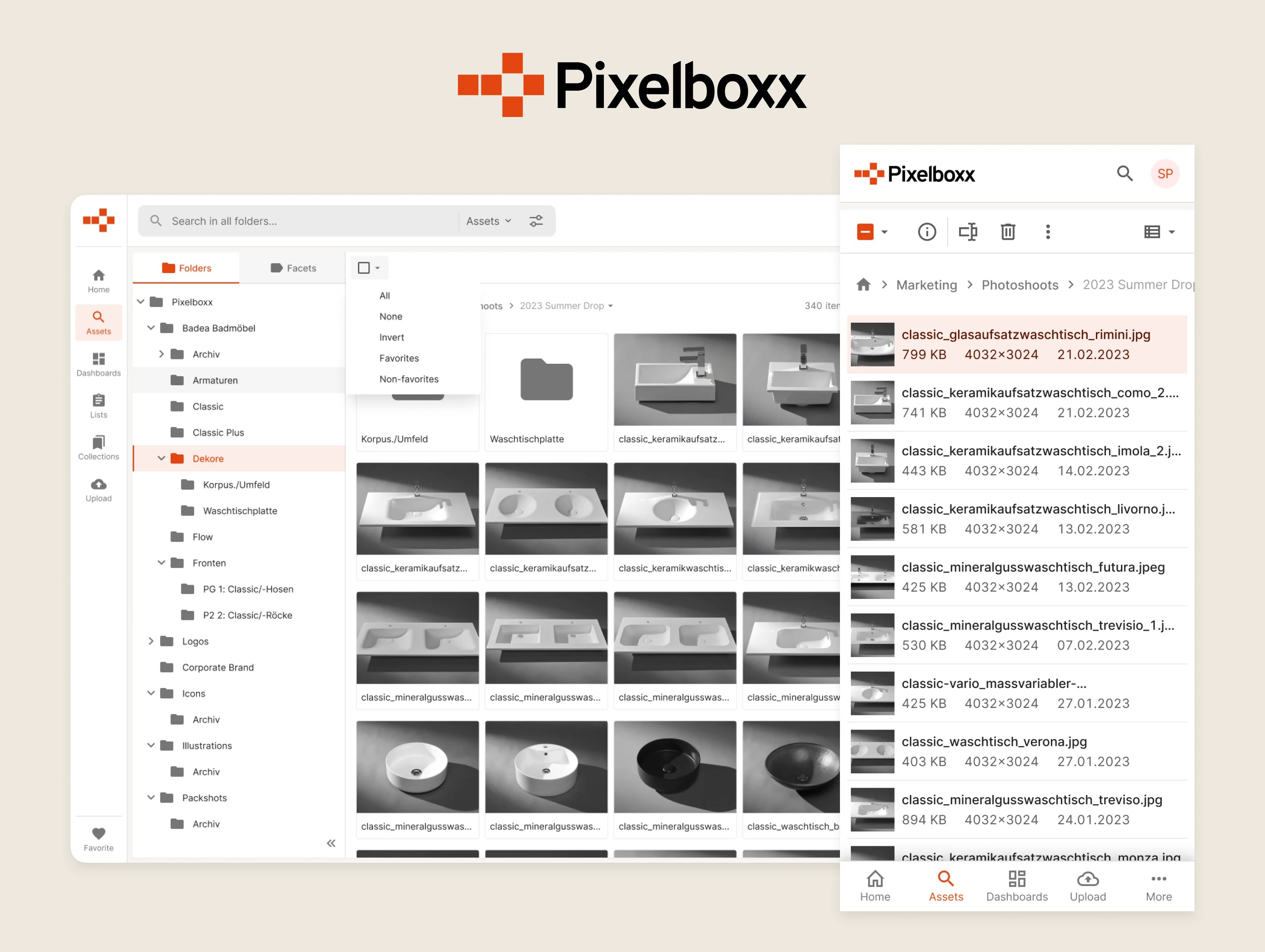
The company's most important product is the Digital Asset Management (DAM) platform. It's used by medium-sized business and industries to store, catalogue, manage and process their increasingly large media libraries, containing tens of thousands of photos, graphics, documents, audio and video files, collectively called assets.
Visual Refresh
The first challenge I encountered was related to the application's visual language was showing its age. Colors, typography and layout weren't properly tuned to communicate a balanced visual hierarchy, which's necessary to effectively guide users actions on the app.
Naturally, an uneven visual hierarchy can negatively impact discoverability and usability of the available tools and features, creating obstacles in the user's workflow, ultimately giving the impression of an inefficient and brittle software.
Early on we decided to abandon the teal color which was being used primarily in the application in favor of the brand’s own orange color. Its usage was toned down to only a few places, being used mostly on interactive elements such as links, buttons and form controls.

Accessibility is often thought out as a box you check only to address a well-defined user group, to comply to some loosely enforced policy but turns out it's an important aspect for a wide range of users in all kinds of organizational and situational contexts.
Thereby, I also tweaked the color palette several times in order to achieve a pleasant, uniform selection, while making sure it remained legible in different use cases.
Design System
It also became clear early on that in order to achieve a consistent, pleasant looking user interface we'd need to work on a system that provided all the necessary parts, or components.
At the same time, it was imperative that the engineering team was able to start working quickly, which's why we decided to adopt a UI framework called PrimeNG.

PrimeNG was used as a starting point and offered all the basic building blocks which could then be customized and extended to fit the products requirements and visual guidelines.

