Summary
On this page I'll talk about some of the challenges, usability considerations and solutions I've found when designing a complex web application like the Pixelboxx DAM. So while in the Pixelboxx UI Refresh project I talk about visual design, color, typography and the way the software looks, here I will talk a lot more about users, usability, accessibility and how the software works.
During my two and half years at Pixelboxx I had the opportunity to design a number of features and enhancements that significantly improved the user experience of the software. I participated in all development phases and gained important insights into metadata organization, user customization, taxonomy planning, accessibility requirements, and more. Below, I'll highlight some of the key results of this work.
- Customizable dashboards
- Streamlined asset details and metadata editing
- Improved asset browser experience
- Simplified asset upload process
- Unified search field and advanced search enhancements
- Inclusion of idle, empty, error and loading states
- Planned a full set of keyboard shortcuts
- Designed a library of 30+ widgets
- Single sign-on flow
- Mobile optimized interface
Introduction
When I started working at Pixelboxx I was faced with a number of questions that I had to find answers to. Most importantly, I had to learn who exactly the target audience of this product was and what they used the product for.
Through constant discussions and collaboration with our team I was able to gain important insights into how the product worked, some of its quirks, peculiarities and strengths that had accumulated over its twenty years of existence. It became clear that customers appreciated what the software had to offer in terms of features, but the ease of use and speed were lacking.
You see, a Digital Asset Management (DAM) application is a complex piece of software that's used by companies to store, organize and distribute media files, or assets, such as graphics, photos, videos, documents, and so on. I know it sounds kind of trivial, but what exactly is a DAM system?
Content Warehouse
If you think about it, there are a number of apps out there which are being used to manage all sorts of stuff: recipes, games, ROMs, movies, books, emails, contacts, notes, photos, videos, icons, fonts, music, passwords, documents.
There are also custom solutions for things like Magic the Gathering cards, clothes, personal belongings, house plants. In the past they may have been created using HyperCard, today people might find a good use for modern tools like Coda, Notion and AirTable which combine the power of relational databases with user-friendly interfaces.
Let's not forget the tool that people use every day: the computer's file system. For PC users, it's Windows Explorer and for Mac users, we've got Finder. On mobile devices there's a lot of abstractions that we're still getting used to. Finally there are cloud or backup apps like Dropbox, iCloud or OneDrive.
Unlike most of these solutions, which are often aimed at personal use, a DAM system serves a number of use cases that simply don't make sense for individuals. For one, they need to support a large number of file formats. They also need to communicate with other software such as CMS and ERP applications that industries use to manage inventory, production, orders and sales, just to name a few. This typically doesn't apply to a home user.
On the other hand, there are some basic design principles that people come to expect from their previous experience using software at home.
Design Principles
By now we'd assume that most people know how to select, copy and delete files. They know how to search for things on the internet. Most of them also know what's a web address. Sure, not everyone may not know what URL stands for, but they probably know how they look like when they see one. The devil here is in fact in the details.
So while some people might use keyboard shortcuts, others might prefer using mouse and drop-down menus, others still might rely on mouse gestures, voice commands or a combination of those. It all depends on context and use case.
Another important aspect to consider is the nature of Internet's medium. Take hyperlinks for example, they need just a single-click to open a new page, so most websites rely solely on that. Om the other hand, apps and, by extension, web apps, often benefit from a more granular interaction model, which can be extended by using the mouse's single- and double-click events, as well as its secondary button, hover and drag gestures to trigger specific actions, open context-menus, show previews, etc.
When I started working on the Pixelboxx DAM project, its user interface had a mismatch of interaction models that caused a number of usability issues, disrupting users.
Ultimately, my goal was to identify and fix these incongruences and, from there, work on new features and quality of life improvements.
Core Use Cases
Two of the most important areas of the DAM application are the Asset Browser and the Metadata Editor, as most of the functionality provided by the software can be accessed from this area.
To get into the user's headspace I came up with a couple of scenarios that gave me an overall idea of how some of the key features of the application are used in context.
- A marketing assistant wants to find product photos for the summer marketing campaign, copy their public URLs and embed them in the newsletter.
- A journalist wants to find and download high-resolution photos from last week's press event to publish a new magazine article.
- A designer wants to share brand assets with an external audience.
Naturally, the application offers much functionality. Users want to find, preview, collect, classify, approve or reject, organize into folders, view and edit their metadata, rotate, resize, add filters, remove background, add watermarks, manage permissions, bookmark, export, print, share the desired assets.
One approach I found that can help deal with the complexity of such a project is something called Progressive Disclosure. It's an interaction design technique that defers advanced or infrequently used features to subsequent screens. It also structures workflows so that information is presented only when it's relevant to the task at hand, simplifying learning and reducing errors in applications.
Simplifying the Toolbar
One thing that I noticed immediately was the number of buttons contained in the application toolbar, like twenty or so. That's a lot! Having so many buttons makes it hard for users to discover and use the toolbar. Some of the buttons even had unclear or misleading icons, which made things worse. The solution I found involved rearranging some of the buttons, updating the icons, adding dividers, moving some of the buttons to drop-down menus and hiding/showing the buttons based on user selection.
Using the principle of progressive disclosure, I hid all unnecessary buttons from the toolbar when no assets were selected. This leaves visible only the Selection Toggle on the left and the View Controls on the right. Some actions have been moved to a breadcrumb, filter, and sort drop-down menu.
More work could be done to further simplify the toolbar, but we had several limitations that prevented us from merging or removing some of these buttons that depend on redesigning their functionality.
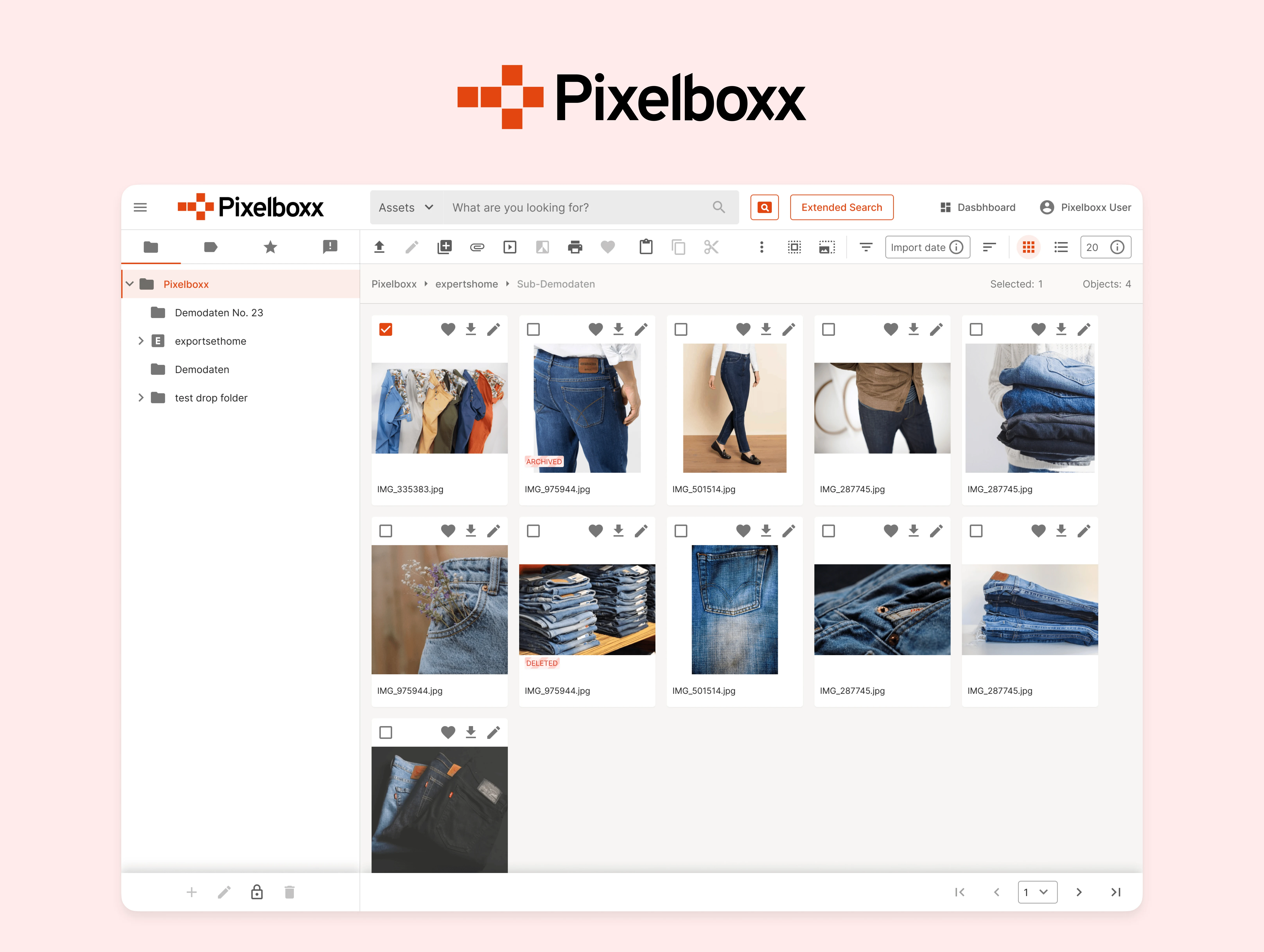
Asset Browser
The Asset Browser interface suffered from several usability issues. First, selecting items was cumbersome because users had to specifically click in the checkbox. If they clicked on the thumbnail itself, they'd be taken to the asset details screen.
To make selection and navigation more convenient, I changed this behavior so that users could click anywhere in the thumbnail to select the asset. If they double-clicked instead, they'd navigate to the details screen. This two-tiered interaction more closely reflects what users expect from a typical file management operation.
Originally, the Asset Browser interface offered two different view modes: list and grid. The bad thing about this was that the layout didn't make good use of the available space. In the redesign, I fixed this and added two new options: Table View and Tile View, which provide a more granular and flexible browsing experience.
The Table View, in particular, provided a dense view of the assets, including additional information displayed in columns such as file size, which can be easily tracked and compared by the user.
Asset Details
Previously, asset metadata and information was grouped into seven distinct sections or tabs: image caption, credits, source, Exif data, image attributes, usage list and folder paths. In practice, though, the arrangement lacked a clear, logical order and some of the fields even had duplicates. Basic information, such as file type, size, dimensions or creation data, for example, was buried in the 5th tab.
The redesign reduced it to five tabs: overview, metadata, usage, versions and linked objects. Here, the most important bits of information were consolidated into the overview and metadata tabs, resulting in less back and forth from the user to find the information needed.
The layout of the metadata tab was also completely redesigned. Previously, the grouping and ordering of the metadata content didn't follow a logical sequence, so I looked at Exif and IPTC's IIM standard specifications as well as how other professional apps like Adobe Bridge have done it and followed a similar pattern. This way, users that already had previous experience with other this kind of software would feel familiarized immediately.
Details Panel
Another addition to the Asset Browser interface was the Details Panel, which could be opened using a button in the toolbar or pressing a keyboard shortcut. This panel appeared next to the asset listing and allowed users to quickly access the asset details screen without ever leaving the browser. A huge benefit of this approach is that users don't lose their context, and they can alternate easily between asset selection and data proofing.
Inline Metadata Editor
Previously users had to navigate into a separate screen in order to view the metadata for a given asset and when they wanted to edit even a single field they had to press a button in the toolbar to go into edit mode.
By removing the edit mode altogether and moving the edit metadata into an inline action, users are able to do it more quickly. When hovering metadata items with the cursor, editable items are highlighted with a darker background. The user only has to click in the metadata text to bring a text field. The save and dismiss buttons are placed conveniently right next to the text field, or they can press Enter to save the changes. The added benefit of this approach is that it decreases the risk of losing unsaved changes.
Infinite Scrolling
One of the challenges in designing the Asset Browser was the pagination element. When a person opens a file management app on their computer, they expect to see all the files that exist in each folder by simply scrolling.
Due to technical limitations, users had to manually paginate the asset list, likely disrupting their flow, which was set on the assets themselves. What's worse, this created extra workload, because users now had to actively keep track or remember which page they had seen a particular asset on so they could go back later.
The solution I proposed consisted of two parts: first, lazily loading the next pages automatically as the user scrolled, giving the illusion that all assets were loaded instantly, and secondly, displaying small text anchors next to each pagination that the user could later use to jump to a specific location.
Empty and Loading States
An integral part of any application is the content that they present, in our case, assets. But what happens when the content is loading, or when there's nothing to show?
This kind of temporary interface is often overlooked in web applications, but it provides users with useful feedback about what's happening and they can also give hints about what to do next.
A loading or “skeleton” state is a kind of temporary interface that not only provide feedback that a process is running, they also serve as a placeholder for the content that's going to appear. The benefit of this approach is that it can improve the perception of speed of the application.
Accessibility and Keyboard Shortcuts
A keyboard can be used not only for text input but also for navigation. This is particularly useful not only for regular users, but specially for people who depend on assistive technologies such as screen readers or people who have limited motor function. So it's really helpful to establish a system with three levels of accessibility and keyboard access that the application can support.
At a minimum, all content, navigation and interactive elements should be accessible using only a few keystrokes, such as Tab, Space and Enter keys. Along with other technologies, such as alternative text, semantic markup and speech synthesis, it's part of the WCAG standard.
At the second level, main actions are available through keyboard shortcuts. This includes, for example, pressing the Esc key to dismiss a prompt, hitting the Enter key to submit a form, pressing the / key to focus the search field and using the arrow keys to select text and objects. These are not mandatory but can really degrade the usability if not present.
Finally, at the highest level, the whole application can be used only using the keyboard. This is useful for some audiences and can really boost productivity but also take some time to learn and use productively.
Our goal was to provide a set of keyboard shortcuts that could speed up workflow while still being fairly easy to remember. This list could be expanded gradually based on user feedback. Help content and hints were fundamental for providing discoverability.
Wrapping Up
This project was a journey into understanding the delicate balance between functionality and usability. It honed my skills in creating components in Figma, and deepened my appreciation for progressive disclosure in user interfaces.
As I continue to grow and evolve in my career as a UX/UI designer, I look forward to working on projects where I'm tasked with finding solutions to usability challenges that balance usability and complexity, always with the user's needs in mind.