Introduction
The Carro Fácil service was already well estabilished under Porto Seguro's portfolio. It offered customers a simple way of getting a new car which they could keep for a limited period of time without all the inconvenciences and the commitment of regular financing.
The app allowed customers to have access to the most important services necessary for managing their subscription and using the vehicle, which otherwise would take place over the phone, including: roadside assisstance, payment history, odometer information and periodic maintenance.
Challenge
This project lasted about four weeks. First, I took the time to dive deep into how the service worked, what processes and which people were involved. I also got to talk to customers in order to understand their goals and pain points they experienced with the existing solution.
Next, I progressed into creating a number of wireframes which covered processes like odometer reading, assistance calling, history viewing, maintenance scheduling, among others.
There were a multiple times I needed to discuss some of the hairy details with the client about proccesses that needed clarification.

Solution
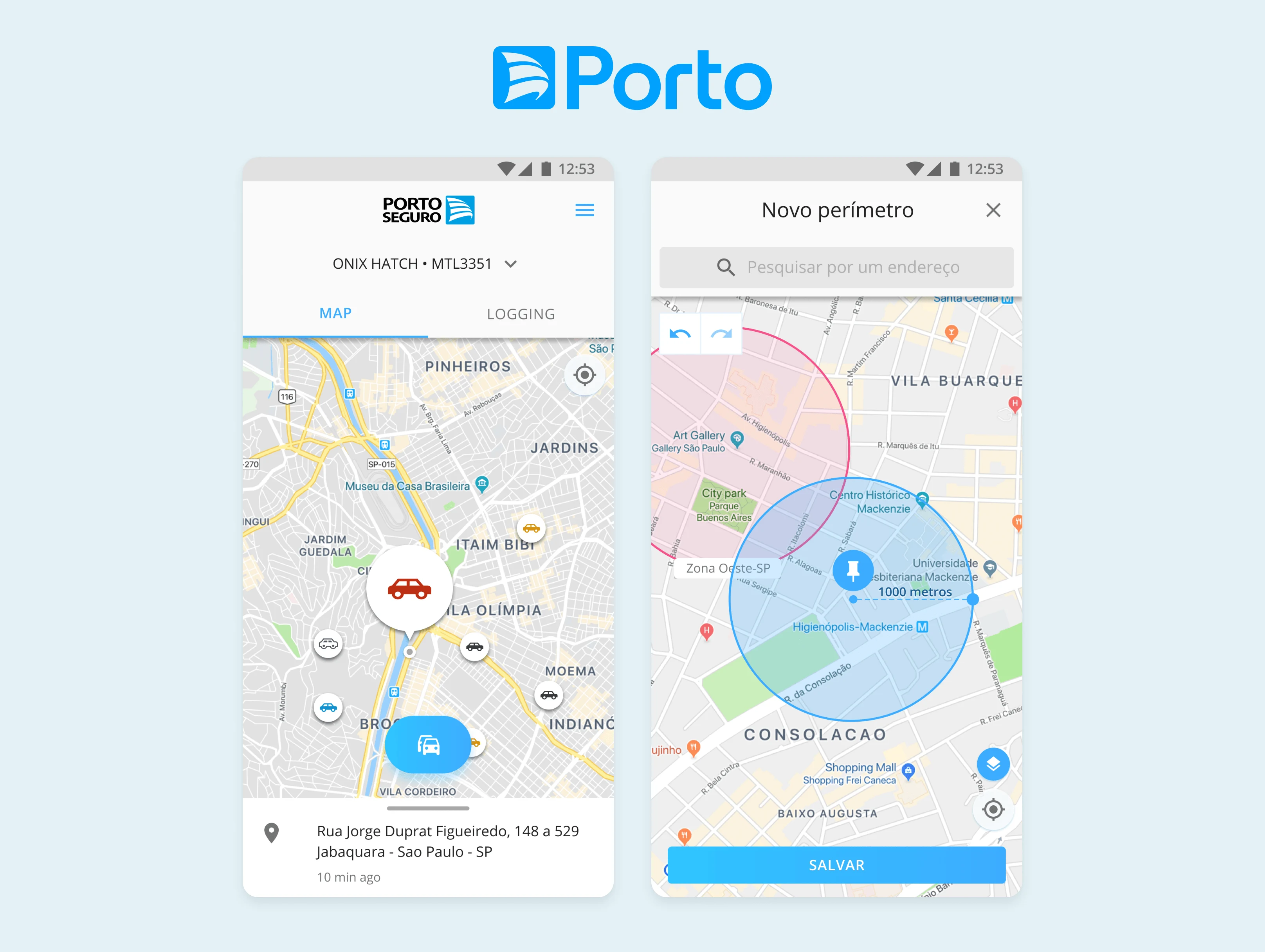
Once we were decided on the core user flows, I moved on to creating higher fidelity wireframes. That's when I decided to stick to Google's Material Design, for which it provided the basic components and a practical look geared towards this utilitarian app.
Naturally, knowing that the majority of the target audience used some kind of Android device also contributed with this decision.
It was equally important that users received the assurance and information they need, similar to how it takes place during a phone consultation. The way I solved it was creating interstitial screens which provided extra information about a service or process they were inquiring.
Results
The design was well received by stakeholders and engineers, which praised the focus on the user experience, the ability to access the most important services from the main screen and the adherence to platform conventions, which made development easier.